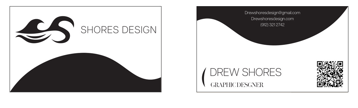


The design originally started as the wave connected my full name.

My last name plus the wave image made the logo toolong so I decided to keep only the wave connect to the "S." I went through many iterations of the logo but ultimately landed on one I thought was best.

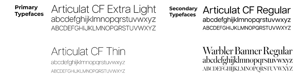
Next was to choose a font for the title of my personal brand. I ended up choosing Articulat CF Extra Light.

The logo itself is a wave connected to a "S" with two strokes underneath that resemble waves crashing onto a shore. It also includes a thin, modern, sans serif font to compliment the thick strokes of the logo.
TYPOGRAPHY
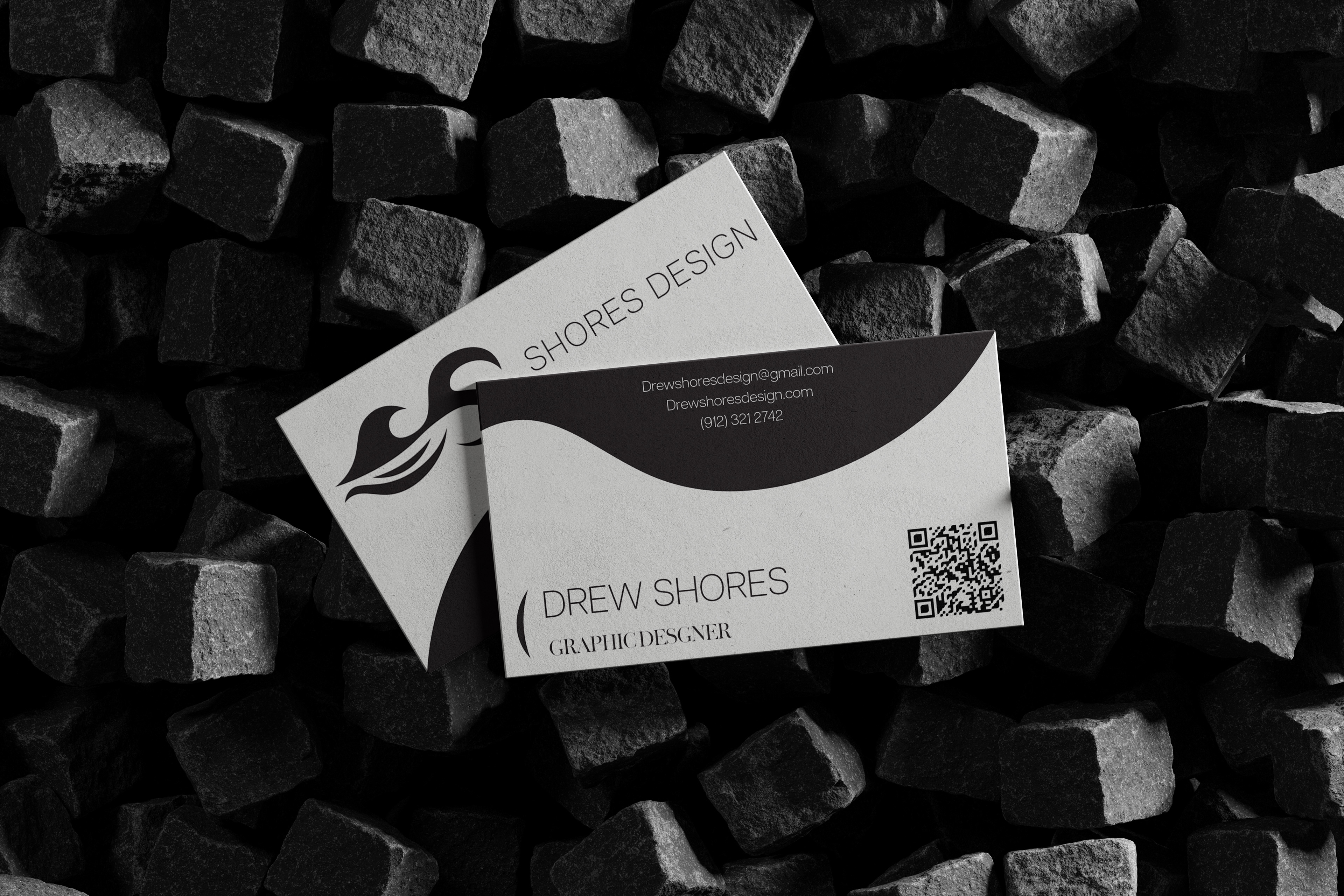
BUSINESS CARD